September 30, 2011

Pleasantly Surprised

It’s been a very “light” kind of week. By which I mean, of course, that Denny and I have been very busy changing out any light fixture that we can get our hands on. However, this one was all mine (you’ll see why I’m so quick to claim it after I show you the pictures).

See this light? It’s not been a favorite of either Denny’s or mine. Pretty much from the moment we bought our house we’ve been contemplating switching it out. For a long time it was even uglier than this picture shows, due to a bare CFL inside that crackly globe. I took it upon myself to switch out the curly-CFL for a round (but still energy efficient!) one long ago. And…meh? It was somewhat better. But I still wasn’t impressed by that bare-bulb kind of look.
So, after being mildly annoyed with the look for a couple of weeks, I decided to swap out the bulb yet again, this time for something crystal clear and…uh, well, admittedly, somewhat less efficient. Fine! I’ll admit it. In this case, I chose esthetics over the environment. What a bad Seattleite I am.
AnyWAY, I was feeling just the tiniest bit bad about this decision until I flipped the switch on the light and this happened:
I’ve got to admit, once I saw this groovy little light show, all my guilt immediately disappeared. Because, dudes, this light fixture just went from so-so to psychedelic (excuse my hippie-speak, if you please).
And at night, it only gets better…
Whenever I turn it on now, I’m torn between staring into its glowy depths and being all like “Whoa, duuuuuuude” or flitting about like Ariel singing “Part of Your World.” It’s equal parts undersea grotto and electric lightening ball, but either way, both Denny and I are now so completely enamored of this light that we’ve sworn to never take it down. Ever.

September 29, 2011

An Adventure in Abstract Art (aka: An Alliterative Advice Article)

Go ahead and say that five times fast! You know you want to...


Way back when, practically in the Dark Ages, I found this photo at HGVT.com. Of course, as you all know by now, it was the driving inspiration behind the little remodel that we did for Amanda’s living room last weekend. Everything about it (except for maybe that picture of those somewhat suggestive peaches) screamed, “I belong to Amanda!” And who am I to deny screaming inspiration when it whacks me in the face?
So, I right away began analyzing what particular elements I could take from this room and replicate in Amanda’s. One of the pieces that was an obvious cornerstone around which the whole room was built was, of course, that deer over the mantle. However, I knew that we were probably going to have to settle for something somewhat less ceramic (because ceramic animal heads = EXPENSIVE, in DesignLand) and I also knew that the odds of us being able to paint the top half of Amanda’s mantle orange were also slim-to-none. I began searching for alternatives.
Right away, the idea of going to Cardboard Safari for a deer head occurred to me. That part didn’t take much thought—I’d long been admiring their unique cardboard version of taxidermy (odd, but true). Although, how to create a lovely, orange, textured background for said deer…well, that took a bit more mulling over. First, it had to be removable. Stretched canvas? Hmm…probably not. Giant orange tapestry? Uh, NO. A large picture frame? Alright, that’ll work. My next thought was of what to frame. I played around with the idea of finding some interesting fabric to use as a backdrop but, let me tell you, finding a good orange fabric that’s not covered in pumpkins or lurid Hawaiian flowers is quite the challenge.
In the end, I decided to try my hand at painting a backdrop. I went hunting through my art supplies and ended up on the floor in front of the TV (old habits die hard) with some textured white cardboard, a collection of old orange and yellow acrylic paints, some paper plates, and a single 1” wide paintbrush.

I used the paper plates for mixing the colors to create different hues and shades (thus expanding my selection from 6 to about 20) then began randomly applying paint with varying lengths of strokes.

I knew the dimensions that my final work needed to be, so I just kept them in mind as I went along, making sure to extend the paint about two inches beyond those marks. My reasoning behind this was that I didn’t want to have any obvious “starts” and “stops” in my painting; I wanted it to feel very organic and not too contrived.
It’s also worth noting that I used a dry brush and didn’t stop to rinse it between colors. This resulted in lines that faded into each other better—much less crisp, more ragged. After mixing and brushing for about twenty minutes (just long enough to cover every speck of white and for me to be satisfied that everything blended well), I ended up with this:

At this point, I was still a little unsure, but once I got out my utility knife and trimmed the edges to the desired size, I began feeling much better about my decision to make something of my own instead of buying.

It turns out that they ended up being just what Frank (Amanda’s name for her new deer friend) needed. Just the right amount of pop, without being too busy and competing for attention.
So, what’s the moral of this story? “Don’t be afraid to make your own art!” I was pleasantly surprised by this experience and I’ll definitely feel less hesitant to try making something of my own next time instead of constantly buying things to fill that empty space on the wall. The other moral of the story was “Even when Ashley has a dedicated art room she still paints on the floor in the living room”—but I guess you had probably already picked up on that somewhat-ridiculous message. ;)

September 28, 2011

This Little Light of Mine

So I have the distinct feeling that blogging is about to get quite a bit harder. Not the taking pictures and writing part, which I like to think that I’ve so far managed okay at, but the finding time to actually do it. Reason? Well, I’m a student. And school is suddenly back in session. This means that my schedule has been turned on its head and that 9:30am photo editing and an 11 o’clock post is probably not going to be a given anymore.
However, having said that, I do hope to continue to do a post a day (or as close as I can get to that). The only difference will be that it might go up at 8am or it might go up at 10pm. You’ve been warned.
Now, onto the real subject of today’s post, which is: We finally got rid of that out-of-place pendant light above the kitchen sink. Huzzah!


This is what used to hang over the sink. Now, it’s not entirely hideous by any means. In fact, in a different style of room, it could be quite lovely. Granted, it needs a good bath, but once the heavy layer of grime is removed, the warm glass would probably glow a little brighter and the detail along the edge would probably be a little spiffy-er.
But, as you probably can tell, it’s so not my style. Almost from the moment I laid eyes on it, I knew it had to go. So when Denny steered us into the lighting aisle of Home Depot the other day (voluntarily, might I add!) I took the opportunity to look through the pendant shades and see what kind of selection was available. I originally liked a simple clear, seeded-glass shade, but Denny pointed out that the fact that it was so clear would highlight the bulb too much…so I crossed it from my list. But when he jokingly held up a subtly patterned, white oval shade, it was love at first sight (he eventually came around to admiring it, too). We ended up coming home with it and a new nickel-finish fixture to replace the old iron-colored one.
When we got home, we wasted no time in getting the thing installed (it was late afternoon and our daylight was slipping away). Of course, the easy part was tearing down the old light.
It took longer to preheat the oven for dinner (pizza) than for Denny to dismantle and pull down the stained-glass fixture. (And sorry for the poor quality of that picture...I honestly don't know what happened to it.)
Next, we measured out how low we wanted the new light to hang. This was a very precise process which involved me holding the light up at various heights while Denny stood under it as if he were going to do dishes. If there was enough space above his head for him to comfortably maneuver, it was considered good enough. Wait, did I say “precise”? In hindsight, maybe not so much.
Once we had our height measured out, we cut the cord to the right length and…hit a snag.
See those little flags on the ends of the wires? They were the labels for which wire went to ground and so forth. And we thoughtlessly hacked them off without marking out what was what. Once we realized what we’d done, there was some panicking and a small bit of cursing, followed by me eventually realizing that someone at one point used some identifying characteristic to label the wires and if they could find them, so could we. So I got started on closely inspecting them and, sure enough, the wires had very, very tiny, different-colored stripes on them. We matched them to the wires that still had flags on them and soon enough we were ready to go again.
After a little bit of finagling, Denny got the fixture wired up properly and in no time at all we were putting on the new shade.

Voila! The lighter finish on the fixture and the bright white of the shade made all the difference in the world. What was previously a fairly-useless pendant is now a fully functional and lovely bit of decoration above the sink. It lights up that area much better than the old one and I can’t help it…every time I step into the kitchen now I go and turn it on, energy bill be damned. Those swirling lines in the glass remind me of sunlit cloud-ripples, and they make me smile every time.

September 27, 2011

An Easy Stenciled Pillow How-To

There were some things in my design for Amanda's living room that just seemed obvious. The baskets for added storage, the hanging lanterns for light, a rug to anchor the space…All of these things required little searching on my part. They just presented themselves as part of the design right from the get-go. Some things, however, like the artwork and the design for the pillows, required a little more research. However, when I first saw this dog silhouette pillow from West Elm, I knew right away that I wanted to incorporate something similar into Amanda’s space.

I right away began searching the internet for the right dog silhouette. Since I planned making a long pillow (I think the dimensions were 12”x28”) I needed a longish silhouette. The obvious choice would have been a dachshund, but since Amanda and Kelly have one large lab-Great-Dane mix and a smaller Heinz 57 dog, I wanted something a little more playful and a lot more athletic. I eventually stumbled upon this one from ShutterStock.com:

At this point, I had a rough idea of how I wanted to create this pillow, but it was really guess-and-check from here on out. First, I made the pillow cover. This was really easy since I bought a pre-made pillow form at Joann’s. Basically, all I did was buy some fabric, make some basic measurements (namely, mark out a half-inch less than the size of the pillow form on all sides, so the cover would fit nice and tight), then I sewed two of the sides and left the other open. I left the one side open so I could lay it flat to do the stencil and so that I could put a piece of cardboard between the fabric, thus preventing it from bleeding through.
Next, I printed off the silhouette at what I thought was the appropriate size. Then, I gathered some basic materials.

Something else that I used which isn’t pictured here (and which actually was the most interesting tool) is a small, fingertip razor from Fiskars. On, second, thought, I’d better include a picture of it…See? Very sharp and very accurate. I have to say, it was crucial to getting the stencil cut out properly.

To replicate the West Elm design, I had the idea that I’d use some leftover contact paper from my window project to create the actual stencil, which I’d then put directly on the fabric and paint the inside, creating the blurred sunset-colors for the dog while still maintaining a sharp edge. And, I’m happy to say, it worked better than I anticipated!

First, I cut out the dog print and then used some double-sided tape to stick it to the back of the contact paper. Something which I did not think of was that since my stencil was going to be adhesive, I’d eventually have to flip it over to stick it to the fabric. In hindsight, I should have mirrored the silhouette, which would have resulted in it being the way I had originally intended, but such is life! And, anyway, I think it turned out pretty well as it is. (In fact, up until now, I bet the only people who knew it’s actually facing the wrong way are myself and Denny! Oh, well—secret’s out!)
After sticking the silhouette to the contact paper, I traced it with a Sharpie. I then removed the original silhouette and voila! A dog shape on contact paper! Let’s hear it, people: “Ooooh! Aaaaah!”

Next, I got out my tiny detail razor and slowly and carefully cut along the traced lines. It’s worth noting that I did this on a heavy-duty cutting board. If I hadn’t, I definitely would have ended up with dog-shaped scratches on my table.
After I finished cutting the silhouette out, I removed it (carefully to ensure that I didn’t warp or tear the stencil) and ended up with this lovely template for my dog pillow!
Alas, this is where my handy photos end, because it was at this point that I got extremely excited and rushed along with the rest of the project without taking any more pictures. However, I can give you the verbal breakdown of how the rest of the project went.
First, I trimmed a little closer around the stencil with a pair of scissors, so there wasn’t quite so much contact paper going on. Then, I gently removed the paper backing and attached my stencil to my fabric. Next, I used some fabric paint (in orange, copper, and yellow) and some small foam craft brushes to randomly go about the stencil’s edge to create the outline. I was very careful about how much I moved my brush when it was in contact with the stencil because I wasn’t sure how well it would hold, but I’m pleased to say that the contact paper held very firmly and I probably could have been a lot more rough with it.
After getting the outline done, I used my paint to swoosh around the different colors, blending the edges and trying not to be too patterned. I wanted the whole thing to look very organic, not like I’d thought about color placement too much.
Once the dog silhouette was entirely filled in, I very carefully peeled back the stencil and threw it away. Denny almost had a heart attack when he saw me detaching the stencil while it was still wet, but I assured him that it was to create a more precise, crisp line—and he eventually saw that I was correct.
I let the paint dry overnight. The next morning I was still really excited…but I also realized that my dog silhouette didn’t quite fill up as much space as I’d originally thought. I instantly thought that I’d need to make some kind of border on the outside edges to cut the white-space down. I thought of a lot of different options, like painting a border, sewing the edges an inch in to create a flat border, or even adding some ribbon to the edges. However, when I got to Joann’s and started looking around, I found some flat carved-shell beads in the jewelry aisle that were perfect. I took them home and messed around with different patterns for about five minutes before deciding on this one.
To make sure that the border ran in a perfectly straight line, I used some two-inch painter’s tape to mark out a line, then began sewing the beads on right along the edge. I didn’t take any pictures because I did it by myself one afternoon and it was definitely a two-handed job. Once the borders were complete, I stuffed in the pillow-form and used a ladder-stitch to sew up the open end of the pillow and the rest is history!

PS: If you have any questions or if something seems confusing, please leave a comment or send me an email and I’ll try to clear things up. This is my first detailed how-to, so I’d really appreciate any comments you have about it. Thanks!

September 26, 2011

Moody Monday: Mission Accomplished!

Remember many moons ago, when I showed you this mood board that I made for my friend, Amanda? And remember how I told you that she was going to kindly consent to me invading her living room and turning the whole space on its head? Well, this was the weekend I got to put the whole scheme into action! (Yes, despite having a somewhat horrific cold, I hauled my sick self down to Oregon to play interior decorator—how could I resist?)
First of all, here are some pictures of what the place looked like prior to the mini-makeover.


Amanda sent me these pictures after she and I talked a little bit about what she wanted to get out of the room. At the time, she said that her main complaints were 1) the bland white walls, 2) having no place to stash her pets’ toys or her husband’s electronic miscellanea, 3) the lack of overhead lighting, and 4) she hadn’t yet hung anything on the walls.
So I got to thinking about possible solutions to these conundrums and ended up making this mood board…

Which, as of Saturday, resulted in this room transformation!


Sorry about the somewhat awkward lighting in the first picture—we didn’t finish the room until fairly late in the afternoon, at which time the whole place descended into semi-darkness.
We (by which I mean, myself, Amanda, and Kelly) all love the end result, and I’m pleased to say that I think we took care of all of the complaints that Amanda used to have about the space. To give you a little idea of exactly what we changed, I’ve written up a little transformation breakdown for you.

First of all, Amanda and Kelly got the go-ahead from their landlord to paint the walls. They chose “Wheat Bread (720C-3)” by Behr. It’s a very nice, subtle grey with warm undertones, and in certain lights it takes on an almost taupe-color. They decided to get the paint in a satin sheen, which really bounces the light around the room and keeps the space from feeling dark. I’m so very much in love with it that I might have to put it in my own house somewhere.
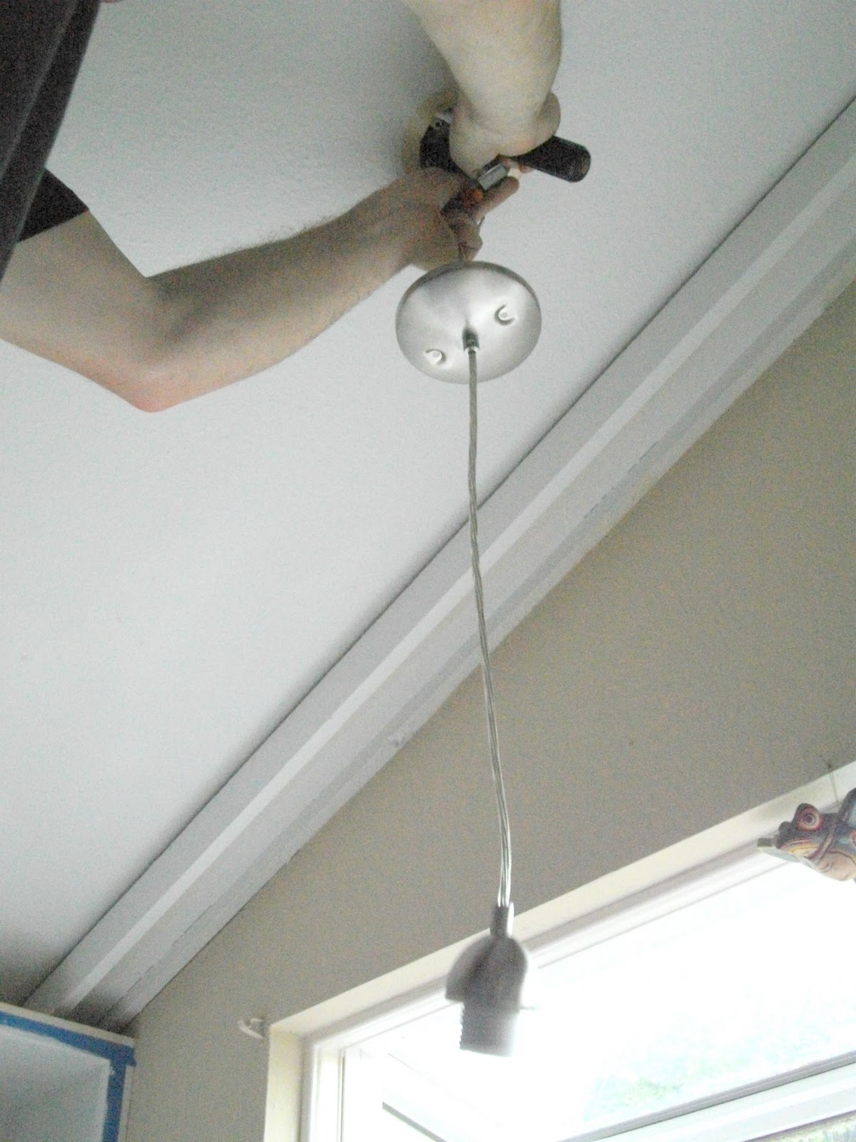
In response to Amanda’s complaint that there was no overhead light in the room, we decided to add some large paper lanterns in the corner, where it was needed the most. I suggested the white lantern and Amanda (in a stroke of genius) also picked up the small orange one. The two of them together creates a sense of movement and the pop of orange is both warm and fun!

Before now, Amanda and Kelly had no accent pillows on either the couch or the loveseat, so I took it upon myself to sew up a few. The two for the sofa are 18” square pillows made from bright indoor-outdoor quality fabrics, so they should hold up to playful pups and lazy kitties. The second one is made out of sturdy, natural-tone canvas, although I wouldn’t recommend using it in any pillow fights, because the silhouetted dog and the beaded trim on the front are both done by hand—my hand, actually! I hate to brag, but I’m darn proud of that pillow, especially since I’ve never done either technique before.
We also addressed Amanda’s desire for more storage. I was able to round up some matching baskets at Joann’s that fit her coffee table perfectly. We put one on top to hold remotes and other electronic stuff, as well as two in the cubbies below to stash other things, like extra books and PlayStation controllers. The candle was one they already had on hand and it fit perfectly with the new color scheme.

Sadly, the rug came out rather crimped when we unrolled it, but you can see that once it flattens out a bit it’s going to look fabulous. The colors in the rug mesh well with the blonde wood floors and the warm grey walls, and the striped border creates an anchoring effect that holds the space together well. It’s also an indoor-outdoor rug (which will hold up better against the dogs), but it’s still very soft and made of some pretty fine fibers, so it’s not too rough to walk on barefooted.

Lastly, Amanda wanted to hang up some large, statement pieces on the wall and, after much deliberation, she and Kelly decided that instead of something abstract they really enjoyed the vintage look of this wall decal from Target. To give it a sturdy background and make it feel more like its own piece of art, I mounted the decal onto some stretched canvas. At first, we were all a little concerned about how much white-space there was around the maps, but once we got it hung up on the wall, the white really popped against the grey walls and we were all happy with the effect.

There were a lot of changes on the other side of the room, as well, including making over the mantle and installing a command center.

This handsome guy (lovingly named “Frank” by Amanda) is actually made of cardboard and is both whimsical and hip (deer heads are really trendy right now). We mounted him within a large picture frame with a bright orange and yellow backdrop, which I painted.

One of my favorite parts of this room is the large orange vessel that I picked up at Ross. I added some of my own dried grasses in it and topped the whole thing off with some twinkle-light-wrapped willow twigs, which can  be turned on and off. The end result adds a bit of mood-lighting to the room and balances out the small wooden chest on the other side of the mantle.
For the command center, Amanda moved the out of place chair, relocated a small bookshelf from behind the couch, and organized the whole thing with some baskets, an OSU mailbox, and a letter organizer. She also hung up a whiteboard just over top of it. Now, they have a place to sort their mail, drop their keys, and leave each other little messages and reminders throughout the week.
By the end of the day, both Amanda and I were so excited about the end result that we could barely tear ourselves away from it (even though we hadn’t eaten all day and were STARVING by this time). The whole effect is warm and sophisticated, as well as being practical and durable. I can’t believe my first attempt at a room make-over went so well. Thank you so much, Amanda and Kelly, for letting me be a part of your experience and for letting me share the results on this blog! :) Now, if only I could get one of my own rooms to look half as awesome!

September 20, 2011

Up Top

Alright, so I know that the fact that I have not finished painting my kitchen cabinets has probably brought great dishonor on my family, but…well, no excuses. It should have been done a long time ago, and now I’m looking at an extremely busy week and possibly an extremely busy next week and it just looks like those puppies are going to have to wait a little while longer.
But that doesn’t stop me from imagining how they’re going to look eventually (someday…maybe…hopefully). It also doesn’t stop Denny from worrying that the whole place will look goofy and unfinished (haha—like it doesn’t now?). I know he has some doubts about this look (and maybe you do, too), but I’ve gone ahead and scrounged up some examples of just how spiffy open kitchen cabinets can look.

Here’s a wide-angle perspective that shows how open cabinetry can add to the kitchen as a whole. Although our kitchen will end up having quite a bit more color in it, I like this overall look. One thing that I find really interesting is that, in order to bounce even more light around the room, these homeowners have put mirrors in the back of some of their cabinets. It’s hard to see the mirrors specifically, but it’s easy to see the bright open effect that it creates.

I bet you can’t guess what I like about this example…Alright, you probably can. It’s the collection of books on the top shelf above the sinks. It seems like a lot of open cabinets end up filled with white ceramics and nothing else, but I plan on incorporating a little more color into mine, starting with some shelves full of books.

Again, the colors in this example are very subdued/non-existent and there seems to be an awful lot of white ceramic going on, but I like the fact that a collection of specialty plates are propped up in the top shelf and I also like the potted plant above the cabinets. Since we have a lot of open space above our cabinets, I hope to eventually place some greenery above ours, as well.

This one ties with the bookshelf-example for my favorite out of the bunch. Again, the reason is probably very obvious: it’s a “cappuccino corner.” Oh, yeah. That’s what I’m talking about (she says in her Gru voice). This picture has me ditching the idea of making the dining room nook (which I’ve apparently never taken a picture of—sorry, guys) into an entertainment bar, like this one:

Instead, I’m now thinking that a cappuccino bar is definitely the way to go. First of all, we don’t drink much hard liquor, and second, I’m thinking that since we do drink copious amounts of coffee, it would definitely be a better use of space. I’m all about it. Okay, okay, though. All coffee-mongering aside, it is lovely, is it not? Warm grey cabinetry, different shades of cups and mugs, a collection of teapots…le sigh. It’s very inspiring for both the someday coffee nook and for our eventual cabinet styling.
Oh, and one more thing…

Happy Birthday, Mommy!!!!!!!!! Yes, it’s my lovely mother’s birthday. Unfortunately, I wasn’t able to make it down for the day-of, but we did get to spend last weekend together doing all the fun and relaxing things that we normally do when we hang out, like catching up on Project Runway, eating ‘Bache to our hearts’/stomachs’ content, and swapping design and decorating inspiration.
Speaking of decorating, this week may be a little sparse as far as DIY projects go, just so you’re prepared. I’m probably going to be spending quite a bit of time working on projects for Amanda’s upcoming renovation and, while I promise to give you a full breakdown after we get it all put together, that means I probably won’t have too much time for my own stuff. So, please don’t boycott me if I do a few more lame-o posts, ok? I solemnly swear that next week I will be up to all kinds of good.
Photo Credits:

First Kitchen from the Lettered Cottage
Second Kitchen from TheKitchen.com
Third Kitchen from Perfectly Imperfect
Cappuccino Corner from Martha Stewart
Bar Cart from Livejournal via Pinterest
Puppy from FunnyPuppySite.com

September 19, 2011

Moody Monday: The Guest Bedroom

I’ve been brooding over what room to make a board for since…uh, last Wednesday. Maybe longer. Which is incredibly sad. But I’ve been noticing that it’s somewhat harder to make a mood board when you already have a certain amount of pieces for said room. Take the hallway bath for example; I already have art, linens, hardware, and potential paint colors for it. This is great progress-wise, but the problem board-wise ends up being that nothing that you own can quite be duplicated for the board, especially if you’ve collected it slowly but surely from a hodgepodge of different places (in this case, Macy’s, Joann’s, Etsy, Home Depot…see?).  Such an endeavor can quickly become a frustrating search for similar products, inevitably resulting in madness due to the sheer amount of not-quite-right stuff available on the net (trust me, I tried making a board for two different rooms only to end up with half my hair pulled out of my head—ok, not entirely true, but in spirit it is).
So, today, I had to sit back and think of which rooms I have the least amount of stuff for. Hallway bath—definitely out of the question. Dining room—not really a good option either, considering that I have fabric, curtains, furniture, etc. for it. Master bedroom—possibly, but I’m still not quite ready to go there… Guest bedroom—ah! juuuuust right!
I’ve had definite plans for the guest bedroom ever since I first saw this beaut:

Yes, that’s the YHL guest bedroom. I’m totally addicted to it. The rich walls, the bright linens, the fun colors…be still my heart!
Initially, I had completely intended to duplicate those gorgeous walls, but once we moved into our house, I pretty quickly realized that such a dark color just wasn’t going to fly in our current space. You see, we call the guest bedroom “the Cave” for a reason; it just has kind of a cool, dark feeling in it already, even with the currently light walls. It took me a little while to get over the fact that adding peacock-blue walls to that already shadowy space just wasn’t an option, and since then I’ve been trying to figure out exactly what would work in that space.
Well, I may have had to let go of my dark wall idea, but the bright linens stuck like a bur in my mind. While at Ross (doing some shopping for Amanda’s project, which I will tell you all about after it’s completed next weekend), I happened upon this sheet set:

Bright? Check. Unique pattern? Check. Beautiful color palette? Check. I tell you, these babies have it all, and it wasn’t long before they became the driving inspiration for the guest bedroom, the result of which is today’s mood board.

1. Just as the concept of boldly-colored linens simply would not remove itself from my mind, so did the idea of playing up those linens with a very simple bedspread. This is a Pottery Barn duvet cover which is clean and simple, but not completely plain. Of course, being a PB product, it’s also a little (lot) bit on the expensive side. However, I think it would be relatively easy to either paint a simple stripe or add some ribbon to a white bedspread to create a similar look. I plan to showcase the fun sheet set (designed by Amy Butler, by the way) by folding back the bedspread and throwing in some solid-colored pillows.
2. I continued to draw on the sheet set for inspiration, this time for the wall color. I’ve heard somewhere that you should always start a bedroom off by choosing the bedding first, and that everything progresses from there. I don’t know if that was advice put forth by bedding manufacturers (seems pretty likely), but it did end up working well for me. I ended up closely examining the colors in the pattern and realized that there was actually some really pretty ice-blue in the border, as well as a bit of rich purpley-blue, too. One trip to Home Depot and about a million paint swatches later, I had two colors picked out: Silver Chalice and Castle Moat. I like Silver Chalice for the main wall color, with an accent wall of Castle Moat behind the headboard.
3. I also knew that I wanted to bring some chartreuse into the room, as well, since it’s also found in the sheets. This file-cabinet-turned-bedside-table would be perfect for that purpose.
4. When I began to think about the rest of the furniture, it became clear that I’d have to make a choice: white or espresso (natural wood grain was out of the choice given the boldness of the other pieces)? Since I’d decided on Silver Chalice for the main wall color, it made sense to look for pieces that had a darker hue. This Moroccan-lattice headboard from West Elm is both dark and airy at the same time.
5. An espresso colored dresser from Ikea would serve the purpose of (duh) storing guests clothing and personals during their stay, as well as acting as a platform for odds and ends, such as a lamp, some pictures, maybe even a small TV.
6. And this easel-style floor-length mirror isn’t only pretty, but would also give guests the opportunity to give their outfit the once-over before heading out the door.
7. I think I’ve mentioned that the Cave (I mean, guest bedroom) has a really unique light situation, with there being no overhead light at all, just a switch outside the room that controls an outlet inside the room. As a result, it’s definitely a little dark in their right now. That situation could be remedied, however, by hanging one or two paper lanterns in the corner.
8. And, lastly, I didn’t want to go too outrageous with the curtains, since there’ll be so much going on with the bedding and some interestingly colored furniture to boot. As such, I decided that a simple, white-eyelet curtain set would be a good way to provide a little privacy and to dress up the otherwise naked window (although we’ll probably add blinds down there, as well).
So, I know that I’m excited about my new plans for this room, but what do you think? Would you be interested in coming to stay at our place if you had this décor to look forward to? Have I put you off with my repeated mention of “the Cave”? Or would you just be glad to have a bed off the floor (the current situation) and don’t really care what the rest of the room looks like? Do you hate that chartreuse side table? You do, don’t you?
Product Breakdown:

Morgan duvet cover in espresso from Pottery Barn - $199
Castle Moat + Silver Chalice by Behr from Home Depot - $32
Chartreuse file cabinet from CB2 - $159
Morocco headboard in chocolate from West Elm - $399
Vallvik dresser from Ikea - $159
Easel floor mirror in black from Target - $68
Hanging paper lantern from Pier1 - $9
Eyelet window panels in true white from Target - $27 per panel

PS: Now you can click on any picture in any of my posts and view the entire collection of post pics larger and in gallery-style (that didn't really make a lot of sense, but once you click on a picture you'll see what I mean). This is especially neat because it allows you to see more detail in the pictures and (in posts with a ton of pictures, like last week's) you can click through all the pictures without text! Thanks, Blogger updates! -A

September 15, 2011

Two Months and One Day

Yesterday was the official two month mark for us living in our new home. It’s hard to believe that it’s only been two months. It feels like a lifetime ago that we got our keys, after waiting for so long and going through so much. That first night in our place was so surreal. After getting our key (and finally booting our real estate agent out the door), we went straight to our storage unit to collect our mattress and some bedding. We hauled it over in the dead of night, then rushed over to the dive we’d been staying at while between our apartment and the new place. We checked out at around midnight and came back to the house, feeling like thieves in the night as we quietly made our way inside and up the stairs. It felt so odd, like we were strangers bunking in an abandoned building. At the time, it was hard to imagine that someday this place would be Home.
And now, only sixty short days later, it feels like this has always been our place. We’ve cut down trees, replaced bathroom doors, slowly collected furniture, repaired things in the crawl space, put up window treatments… Little by little, it’s become ours. And although we still have a long way to go, I thought you might like to see how much it’s changed since we first saw it, to what it looks like today (well, technically yesterday, but I promise nothing drastic has changed since then).


It’s kind of hard to see what’s really changed out front (unless you count the lawn going from spring-green to late-summer-yellow). However, we’ve actually done a few things, like chopping down a couple of rosebushes along the driveway, removing the edges from the front step, and cleaning all the moss off of the roof. And, of course, you can’t see it from here, but there’s the small stoop improvement project and the addition of my lovely red mums.


These pictures, although taken from slightly different angles, are a little more dramatic. It’s easy to see what we’ve done here, like removing all the “extra” bushes and ripping out the pet cemetery.


Moving inside, it’s obvious to see that the carpet has been switched out and the curtains ripped down. The front living room has also been, uh, somewhat flooded with crap (only it’s not crap—it’s all very important stuff that just needs a home still!). There’s the addition of Homer, you can see my spray painted vines propped against the wall, some cabinet doors that still need to be rehung, and a corner devoted solely to my upcoming “Amanda Project,” as Mom calls it.


Here’s the dining room in it’s “before” condition, followed by what it looks like today, both from the original viewpoint and from the stairway leading up. As you can see, we’ve recently hung curtains, but I still need to do a lot of work on this space, including reupholstering the chairs and hanging some art.


The kitchen has had more work done, although it currently looks a little worse for the wear. We still need to rehang some doors and (I’m ashamed to say this) finish painting. There’s also the little matter of replacing those hideous overhead lamps and…oh, only about a million other things. But it’s not all bad. For example, I finally finished my window, we now have a cupboard devoted to recycling, and the new fridge definitely helps matters.


Here’s the gloomy looking lower living room “before” (those fleshy walls, the tacky fireplace, and green carpet weren’t doing it any favors) and also in it’s brighter (albeit very unfinished) “after” condition. In the two months we’ve been here, we’ve done a few things in here, like putting away most of the boxes and moving in a new TV, but there’s still the issue of said TV living on my coffee table and the fact that my bookshelf is currently a dumping ground for homeless knick-knacks. Oh, well. Patience, young Padawan, patience.


Now, here’s something that I’ve never shown you before: the hallway leading into the guest bedroom, half bath, and utility room. Nothing fancy, obviously. I’m kind of ashamed to say that I don’t go down there often and so mostly it just gets the door shut on it and I forget it’s there. For a while, I was even a little scared to go down there (the door shuts by itself and it’s kind of dark and cold), but I’ve since then done my best to man-up and learn to love that part of the house, as well. It’s a lot easier, though, when Mom and Shawn come to stay and this area of the house gets lived in (meaning the bathroom and the upcoming bedroom, not the utility room obviously), making it much more hospitable…


This is the guest bedroom (also known as the Cave, occasionally). I cannot tell you how much I hated its “before” hamburger-chic color palette. Not that its current taupe-wall-and-assorted-bed-linens-and-extra-chairs look is anything special, mind you, but I still think it’s a vast improvement. Oh, and this room isn’t actually as big as it appears, by the way, but since it’s somewhat awkwardly shaped the only way I could get a good picture was in panoramic mode.

Also, never before seen (because it’s kind of boring) is the upstairs hallway. Oooh. Aaaah.


Here’s something more interesting. This is the art studio (again, please forgive me the weird pano-pic). It was in pretty bad shape for a while, having been used as a storage space for anything we didn’t want to look at. But since I needed a large workspace for the art I’m doing up for Amanda’s living room, I decided it was time to clean the old girl up. Here it is in its current condition, complete with enormous piles of art supplies, a bookless bookcase, and my gigantic craft table that I got at a garage sale for $7. Score.


Haha. This is the before-and-after that I like best: Denny’s office. Those purple walls really don’t even need any snarky commentary; they speak for themselves.


Here’s the hall bath, which you can see has changed slightly. New shower rod and curtain, actually clean enough to be useable…yeah. That’s about it.


Likewise with the master bathroom. Not much to be said about it, except that it made all the difference in the world putting up that curtain and getting it cleaned from top to bottom.


And, lastly, we have the master bedroom. The amount of green that used to be in this room completely overwhelms me. Just looking at the “before” picture makes me feel like I’ve crawled under a mossy rock. However, the “after” picture makes we want to curl up and take a nap. It’s not the most decorative room just yet (and I have a feeling that it will stay that way for a while), but it’s comfortable and functional. It also has the only set of blinds to be found in the entire house, so you gotta give it points for that.
Are you still with me? Or did I lose you about 1,000 words and 20 or so pictures back? If you are still there, thank you. Not just for making it through this long post, but also for sticking around to read my little blog. It means a lot to me to be able to connect with everyone this way and I hope that I’ll be able to continue doing this for years to come. Love you all and thanks again! <3 Ashley